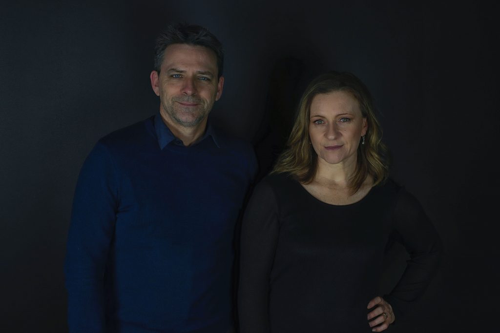
Kate McMahon and Rob Nerlich of mcmahon and nerlich
Feature Interview
Melbourne, VIC, Australia
Architects Kate McMahon and Rob Nerlich have been partners in life and work for many years, working locally and in the UK at several architecture studios together and founding their practice, mcmahon and nerlich, in Melbourne in 2013.
Driven by their passion for a holistic approach to architecture, encompassing interiors and urban design, they also share a keen interest in the role of public architecture. When mcmahon and nerlich were approached to design the interior renovation for their Blue Ivy Project in Malvern, they drew on their holistic view to strategically alter the space, surgically opening it at various points without the need for drastic structural building works to create a thoughtful, light-filled contemporary space.
Prior to establishing their own studio, Kate and Rob applied for the same role at a UK architectural firm. When they were both given the role, it marked the second architectural office they had worked in together. Both feel strongly about the role of architecture in public life, and Rob eventually moved to another practice specialising in urban design to gain more experience in large-scale development, pursuing his passion for how buildings contribute to the city, and how large complexes of buildings can relate to each other. When they moved back to Melbourne they continued to act on their belief in giving back, taking time to teach design at Melbourne University and guest critiquing at RMIT, Melbourne and Monash Universities.
While they are very interested in large-scale and public architecture, Kate and Rob recognise it is just one part of their work. ‘Architects have a love-affair with the family home’, says Kate, ‘we’re always fine-tuning our approach to residential housing’. Rob agrees, noting ‘From our perspective, there’s no fundamental difference between designing apartments and a single house – it’s the same impulse of creating spaces for people to live in, spaces that bring joy’.
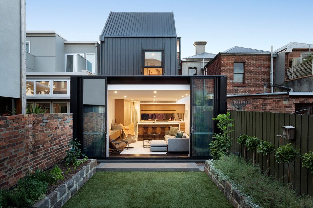
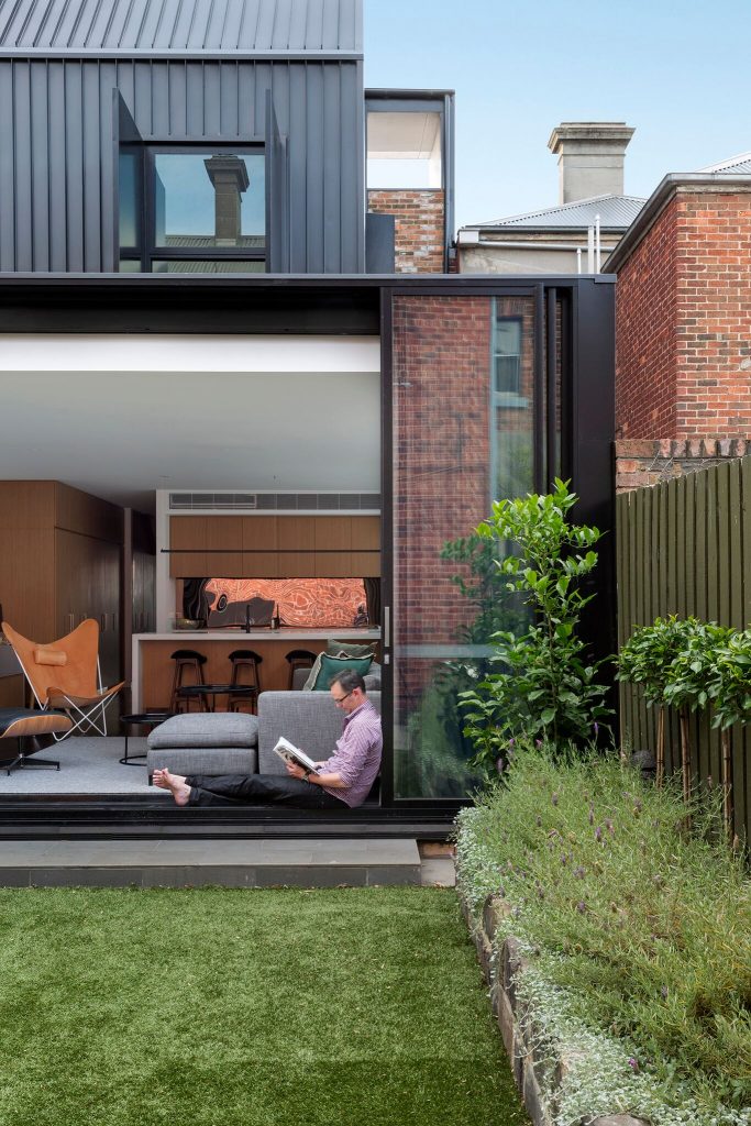
It is clear from their portfolio of work that they take the architectural context into account for individual projects just as they would consider the overall effect of larger developments in their broader context. The Frame Terrace House in Albert Park managed to get planning approval for the modernist extension largely due to the approach mcmahon and nerlich took to the design, which closely considered the effect on the streetscape.
The third storey ‘hides politely’ behind a parapet, and the architects ‘saw potential for a roof terrace, among the chimneys and rooftops of Albert Park.’ ‘We saw it in the language of the backyard shed, the messy, gritty conglomeration of buildings in the backyard’, says Kate. ‘In that context, the black form [of the new extension] makes perfect sense’.
Blue Ivy House, as an interior renovation project, clearly did not require such an intensive consideration about the exterior in relation to the streetscape, however their holistic approach nonetheless influenced the design. ‘One of the reasons Blue Ivy was such a nice project for us was that we didn’t have a lot of opportunity to affect the exterior to the building’, explains Rob. ‘As one of a group of townhouses, the exterior needed to look the same to the street. Instead, we got to apply our architectural thinking to the project – it was an opportunity to show that we don’t see the separation between interiors and architecture.’
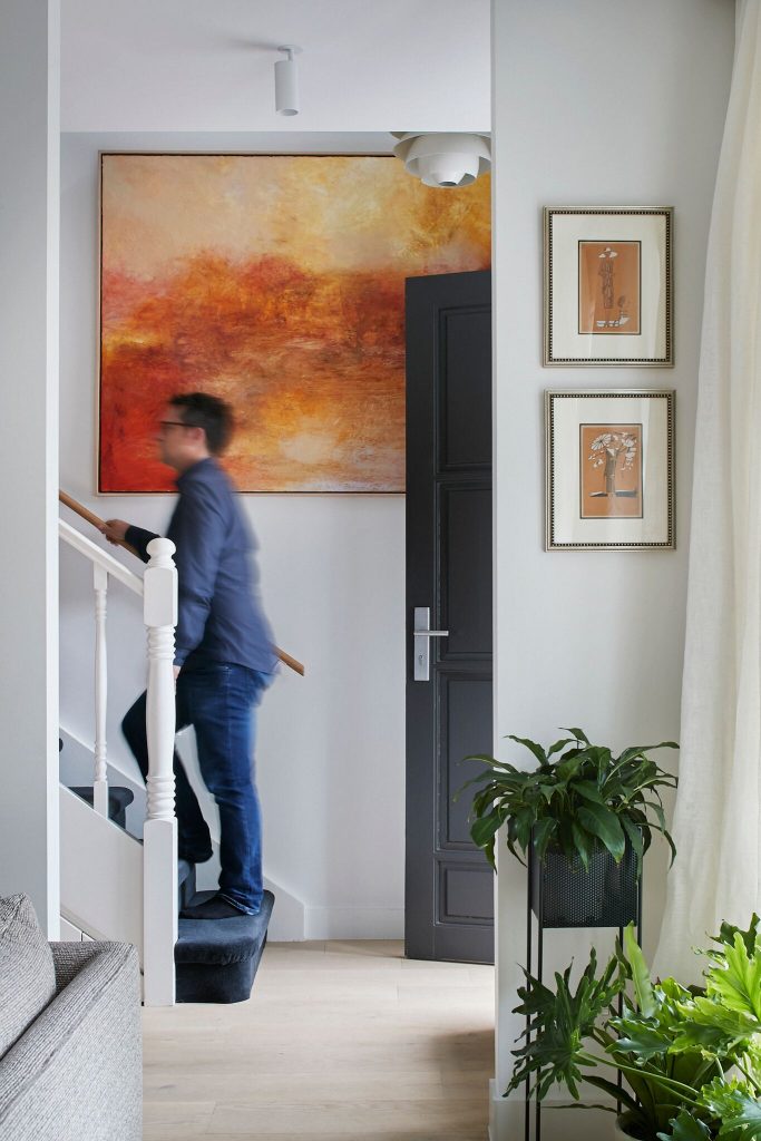
As the original house was built around 1984, they had more scope to be precise with moving walls and changing openings (in comparison with the heavy Victorian masonry of many Melbourne houses). The townhouse has quite a modest footprint, and they respected the original design, choosing to keep as many elements as possible while creating a more open, cohesive space internally.
The stairwell was maintained, and in the bedroom, an existing duct was re-interpreted as a frame around the leather-wrapped joinery that came to form the built-in bed head. ‘In academia, you’ll find architects talking about the idea of a palimpsest, a concept taken from the tradition of retaining traces of a previous work on a manuscript’, says Kate. ‘Thinking of our built environment like a palimpsest by working with what’s there in the city and retaining traces of what has been there before – it makes sense to us to work like that.’
Keeping many of the original elements was not just a theoretical exercise – it is also a more sustainable approach, reducing the amount of waste produced and the need for new replacements. ‘We always try to work very sympathetically with existing buildings, partly as a sustainability strategy of not throwing existing materials away’, says Rob. ‘You sometimes get a richer result by working with what’s there, and it’s part of the challenge of using your skill as a designer.’
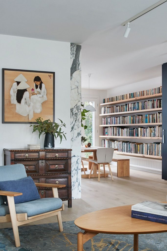
This approach meant that instead of removing as many walls as possible to create a blank canvas, they simply re-envisaged the position of openings. Where a wall between corridor and living room once had a single central opening, they filled in that opening and placed two openings at either end, creating a flow from the kitchen and allowing light to penetrate deeply into the house. The architects then added an additional set of doors to create three sets of French doors to the courtyard letting the breeze in and creating a relationship to the garden from inside.
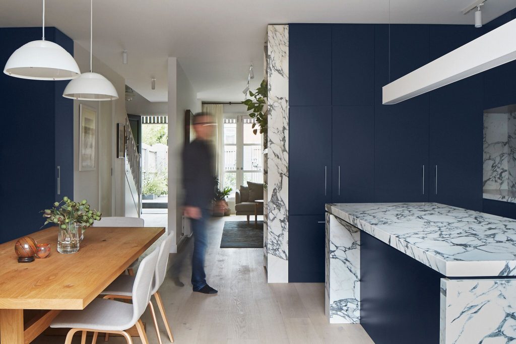
The kitchen was one of the most significant changes, with a carefully considered palette of materials, including Victorian ash timber shelving and matt-blue 2pac cabinetry providing a dark moody backdrop to Arabescato Vagli stone. ‘We love natural materials, their tactility. We use a lot of stone, and timber with natural, low impact finishes’, says Rob. Part of their love of natural materials also stems from their approach to interior finishes that stands the test of time. As Kate says, their work is deliberately ‘not so on trend that it’s going to be out of date in two years and need to be redone, and this is important from a sustainability standpoint as well’.
The Blue Ivy kitchen exemplifies this approach, combining the latest technology and an elegant contemporary aesthetic with rustic touches like the open shelving, Lacanche cast-iron range and French doors. The proximity to the adjacent timber dining table and relationship to the nearby living area ensures it is a social space, becoming not just the aesthetic centerpiece of the interior renovation, but the social and functional heart of the home as well.
Working so closely together for many years, it is clear Kate and Rob share a vision and approach that is continually developing. Their work is bound by a common thread but never predetermined – individually, projects like Blue Ivy House are contributions to their ongoing research into how to create spaces that bring joy.

